Spectral Classification
Contents
Spectral Classification#
# common
import warnings
warnings.filterwarnings('ignore')
import os
import os.path as op
import sys
import pickle as pk

# pip
import numpy as np
import xarray as xr
from sklearn.decomposition import PCA
import matplotlib.pyplot as plt

# DEV: bluemath
sys.path.insert(0, op.join(op.abspath(''), '..', '..', '..', '..', '..'))

# bluemath modules
from bluemath.binwaves.spectra import set_t_h, group_bins_dir_t
from bluemath.binwaves.plotting.spectra import Plot_spectra_transformation, Plot_spectra_random_samples
from bluemath.binwaves.plotting.classification import Plot_spectra_hs_pcs, Plot_kmeans_clusters_hs
from bluemath.binwaves.plotting.classification import Plot_specs_hs_inside_cluster, Plot_kmeans_clusters_probability

from bluemath.kma import kmeans_clustering_pcs

from bluemath.plotting.classification import Plot_pc_space, Plot_bmus_count
from bluemath.plotting.teslakit import Plot_DWTs_Probs
Methodology#
In this section, we are going to classify our predictand (the wave spectra) into a number of clusters (N=49) by reducing the dimensionality of the data by means of a principal component analysis (PCA) and then, performing a clustering of the PCs with the K-Means algorithm.
Database and site parameters#
# database
p_data = r'/media/administrador/HD2/SamoaTonga/data'
site='Samoa'
p_site = op.join(p_data, site)

# deliverable folder
p_deliv = op.join(p_site, 'd04_seasonal_forecast_swells')

p_kma = op.join(p_deliv, 'kma')    # K-Means data
p_spec = op.join(p_deliv, 'spec')  # spectra data

# superpoint
p_superpoint = op.join(p_spec, 'super_point_superposition.nc')

# output files
p_sp_trans = op.join(p_spec, 'spec_daily_transformed_hs_t.nc')             # daily spectrum

p_kma_spec_model = op.join(p_kma, 'spec_KMA_model.pkl')                    # KMeans model
p_kma_spec_classification = op.join(p_kma, 'spec_KMA_classification.nc')   # classified superpoint
# make output folders
for p in [p_kma]:
    if not op.isdir(p):
        os.makedirs(p)
# K-Means classification parameters
num_clusters = 49
min_data_frac = 10  # to calculate minimum number of data for each cluster
Spectral data
# Load superpoint
sp = xr.open_dataset(p_superpoint)
print(sp)
<xarray.Dataset>
Dimensions:  (dir: 24, freq: 29, time: 366477)
Coordinates:
  * time     (time) datetime64[ns] 1979-01-01 1979-01-01T01:00:00 ... 2020-10-01
  * dir      (dir) float32 262.5 247.5 232.5 217.5 ... 322.5 307.5 292.5 277.5
  * freq     (freq) float32 0.035 0.0385 0.04235 ... 0.4171 0.4589 0.5047
Data variables:
    efth     (time, freq, dir) float64 ...
    Wspeed   (time) float32 ...
    Wdir     (time) float32 ...
    Depth    (time) float32 ...
# calculate and add t and h to superpoint
sp = set_t_h(sp)
# group spectra data by direction and period bins
dir_bins = np.linspace(0.0, 360.0, 17)
t_bins = np.arange(0.0, 30, 5)

sp_mod = group_bins_dir_t(sp, dir_bins, t_bins)
sp_mod
<xarray.Dataset>
Dimensions:   (dir_bins: 16, t_bins: 5, time: 366477)
Coordinates:
  * t_bins    (t_bins) object (0.0, 5.0] (5.0, 10.0] ... (20.0, 25.0]
  * dir_bins  (dir_bins) object (0.0, 22.5] (22.5, 45.0] ... (337.5, 360.0]
  * time      (time) datetime64[ns] 1979-01-01 ... 2020-10-01
Data variables:
    h         (t_bins, dir_bins, time) float64 0.0 3.113e-05 ... 3.231e-12
    dir       (dir_bins) float64 22.5 45.0 67.5 90.0 ... 292.5 315.0 337.5 360.0
    t         (t_bins) float64 5.0 10.0 15.0 20.0 25.0
h_t (t_bins, dir_bins, time) float64 0.0 0.02232 ... 7.19e-06- dir_bins: 16
- t_bins: 5
- time: 366477
- t_bins(t_bins)object(0.0, 5.0] ... (20.0, 25.0]
array([Interval(0.0, 5.0, closed='right'), Interval(5.0, 10.0, closed='right'), Interval(10.0, 15.0, closed='right'), Interval(15.0, 20.0, closed='right'), Interval(20.0, 25.0, closed='right')], dtype=object) - dir_bins(dir_bins)object(0.0, 22.5] ... (337.5, 360.0]
array([Interval(0.0, 22.5, closed='right'), Interval(22.5, 45.0, closed='right'), Interval(45.0, 67.5, closed='right'), Interval(67.5, 90.0, closed='right'), Interval(90.0, 112.5, closed='right'), Interval(112.5, 135.0, closed='right'), Interval(135.0, 157.5, closed='right'), Interval(157.5, 180.0, closed='right'), Interval(180.0, 202.5, closed='right'), Interval(202.5, 225.0, closed='right'), Interval(225.0, 247.5, closed='right'), Interval(247.5, 270.0, closed='right'), Interval(270.0, 292.5, closed='right'), Interval(292.5, 315.0, closed='right'), Interval(315.0, 337.5, closed='right'), Interval(337.5, 360.0, closed='right')], dtype=object) - time(time)datetime64[ns]1979-01-01 ... 2020-10-01
array(['1979-01-01T00:00:00.000000000', '1979-01-01T01:00:00.000000000',
       '1979-01-01T02:00:00.000000000', ..., '2020-09-30T22:00:00.000000000',
       '2020-09-30T23:00:00.000000000', '2020-10-01T00:00:00.000000000'],
      dtype='datetime64[ns]')
- h(t_bins, dir_bins, time)float640.0 3.113e-05 ... 3.231e-12
array([[[0.00000000e+00, 3.11349244e-05, 3.11910083e-04, ..., 3.06478958e-03, 2.89574828e-03, 2.73886199e-03], [0.00000000e+00, 1.80685423e-06, 1.33951845e-05, ..., 2.37702101e-03, 2.34484696e-03, 2.30716130e-03], [0.00000000e+00, 7.58283830e-07, 6.98746678e-07, ..., 6.24030754e-03, 6.28689592e-03, 6.28141254e-03], ..., [0.00000000e+00, 5.14713811e-05, 1.17267312e-04, ..., 7.14164435e-06, 6.11682875e-06, 5.17876075e-06], [0.00000000e+00, 1.41668210e-04, 6.01923627e-04, ..., 3.26184647e-04, 2.87286788e-04, 2.51249345e-04], [0.00000000e+00, 4.64471265e-05, 2.51691087e-04, ..., 6.59610259e-04, 5.95605131e-04, 5.36711929e-04]], [[0.00000000e+00, 7.11408997e-31, 2.02724002e-16, ..., 3.10718110e-03, 2.98661384e-03, 2.88783593e-03], [0.00000000e+00, 5.08657380e-31, 6.11422932e-17, ..., 4.48136933e-03, 4.39138233e-03, 4.32624788e-03], [0.00000000e+00, 0.00000000e+00, 4.37325344e-29, ..., 1.55227585e-02, 1.48618800e-02, 1.43029488e-02], ... [0.00000000e+00, 0.00000000e+00, 0.00000000e+00, ..., 3.48686162e-07, 2.62982218e-07, 1.95517035e-07], [0.00000000e+00, 0.00000000e+00, 0.00000000e+00, ..., 2.39094889e-07, 1.99053004e-07, 1.67888723e-07], [0.00000000e+00, 0.00000000e+00, 0.00000000e+00, ..., 1.15184972e-09, 1.83236785e-09, 3.36293515e-09]], [[0.00000000e+00, 0.00000000e+00, 0.00000000e+00, ..., 5.50293249e-12, 5.20127855e-12, 4.72860905e-12], [0.00000000e+00, 0.00000000e+00, 0.00000000e+00, ..., 3.41735067e-11, 2.28758609e-11, 1.65528621e-11], [0.00000000e+00, 0.00000000e+00, 0.00000000e+00, ..., 8.30155898e-11, 6.91127669e-11, 5.85627024e-11], ..., [0.00000000e+00, 0.00000000e+00, 0.00000000e+00, ..., 1.01259923e-11, 1.54939826e-11, 2.21672013e-11], [0.00000000e+00, 0.00000000e+00, 0.00000000e+00, ..., 1.71381475e-10, 2.25061277e-10, 2.92950465e-10], [0.00000000e+00, 0.00000000e+00, 0.00000000e+00, ..., 2.56900408e-12, 2.85802816e-12, 3.23085859e-12]]]) - dir(dir_bins)float6422.5 45.0 67.5 ... 337.5 360.0
array([ 22.5, 45. , 67.5, 90. , 112.5, 135. , 157.5, 180. , 202.5, 225. , 247.5, 270. , 292.5, 315. , 337.5, 360. ]) - t(t_bins)float645.0 10.0 15.0 20.0 25.0
array([ 5., 10., 15., 20., 25.])
- h_t(t_bins, dir_bins, time)float640.0 0.02232 ... 6.762e-06 7.19e-06
array([[[0.00000000e+00, 2.23194711e-02, 7.06439051e-02, ...,
         2.21442167e-01, 2.15248629e-01, 2.09336551e-01],
        [0.00000000e+00, 5.37677111e-03, 1.46397730e-02, ...,
         1.95018810e-01, 1.93694479e-01, 1.92131676e-01],
        [0.00000000e+00, 3.48317977e-03, 3.34364275e-03, ...,
         3.15982469e-01, 3.17159794e-01, 3.17021451e-01],
        ...,
        [0.00000000e+00, 2.86974232e-02, 4.33160131e-02, ...,
         1.06895421e-02, 9.89288937e-03, 9.10275628e-03],
        [0.00000000e+00, 4.76097821e-02, 9.81365275e-02, ...,
         7.22423308e-02, 6.77981461e-02, 6.34033873e-02],
        [0.00000000e+00, 2.72608515e-02, 6.34591002e-02, ...,
         1.02731515e-01, 9.76200906e-02, 9.26681761e-02]],

       [[0.00000000e+00, 3.37380260e-15, 5.69524717e-08, ...,
         2.22968378e-01, 2.18599683e-01, 2.14954355e-01],
        [0.00000000e+00, 2.85280881e-15, 3.12774150e-08, ...,
         2.67772122e-01, 2.65070023e-01, 2.63096876e-01],
        [0.00000000e+00, 0.00000000e+00, 2.64522315e-14, ...,
         4.98361451e-01, 4.87637242e-01, 4.78379746e-01],
...
        [0.00000000e+00, 0.00000000e+00, 0.00000000e+00, ...,
         2.36198615e-03, 2.05127168e-03, 1.76869233e-03],
        [0.00000000e+00, 0.00000000e+00, 0.00000000e+00, ...,
         1.95589320e-03, 1.78461426e-03, 1.63896906e-03],
        [0.00000000e+00, 0.00000000e+00, 0.00000000e+00, ...,
         1.35755646e-04, 1.71224664e-04, 2.31963278e-04]],

       [[0.00000000e+00, 0.00000000e+00, 0.00000000e+00, ...,
         9.38333202e-06, 9.12252469e-06, 8.69814606e-06],
        [0.00000000e+00, 0.00000000e+00, 0.00000000e+00, ...,
         2.33832442e-05, 1.91314865e-05, 1.62740835e-05],
        [0.00000000e+00, 0.00000000e+00, 0.00000000e+00, ...,
         3.64451566e-05, 3.32536355e-05, 3.06105086e-05],
        ...,
        [0.00000000e+00, 0.00000000e+00, 0.00000000e+00, ...,
         1.27285458e-05, 1.57449586e-05, 1.88328230e-05],
        [0.00000000e+00, 0.00000000e+00, 0.00000000e+00, ...,
         5.23650991e-05, 6.00081697e-05, 6.84631830e-05],
        [0.00000000e+00, 0.00000000e+00, 0.00000000e+00, ...,
         6.41124522e-06, 6.76228146e-06, 7.18983571e-06]]])
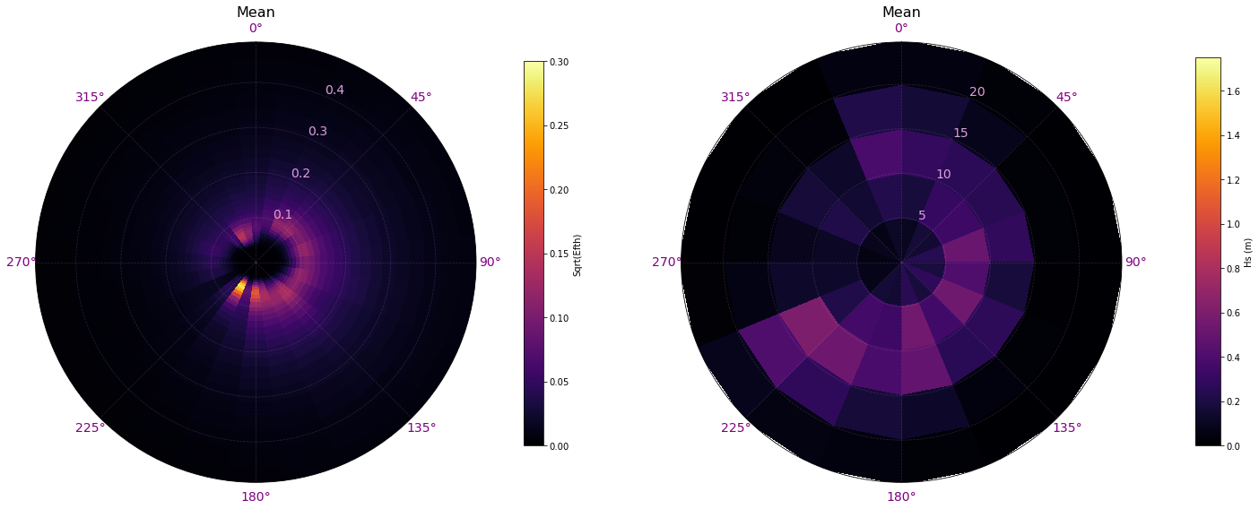
The first step, consists on transforming the spectra from the original data, in energy and frequency, to a modified spectra that represents by directions the Hs (colour) based on the different discretizations of the period (0s-5s, 5s-10s, 10s-15s, 15s-20s and 20s-25s)
Comparison of mean original spectrum vs transformed spectrum:
# Plot superpoint transformation
Plot_spectra_transformation(sp, sp_mod, time = []);
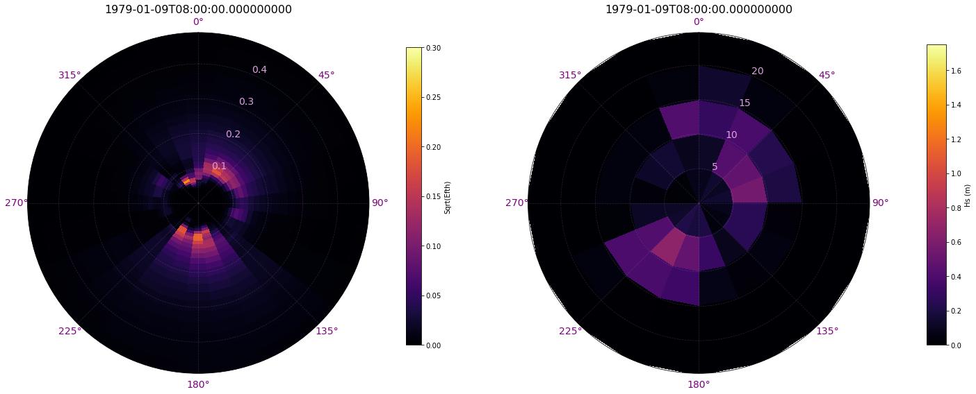
Comparison of original spectrum vs transformed spectrum for a specific time:
Plot_spectra_transformation(sp, sp_mod, time = 200);
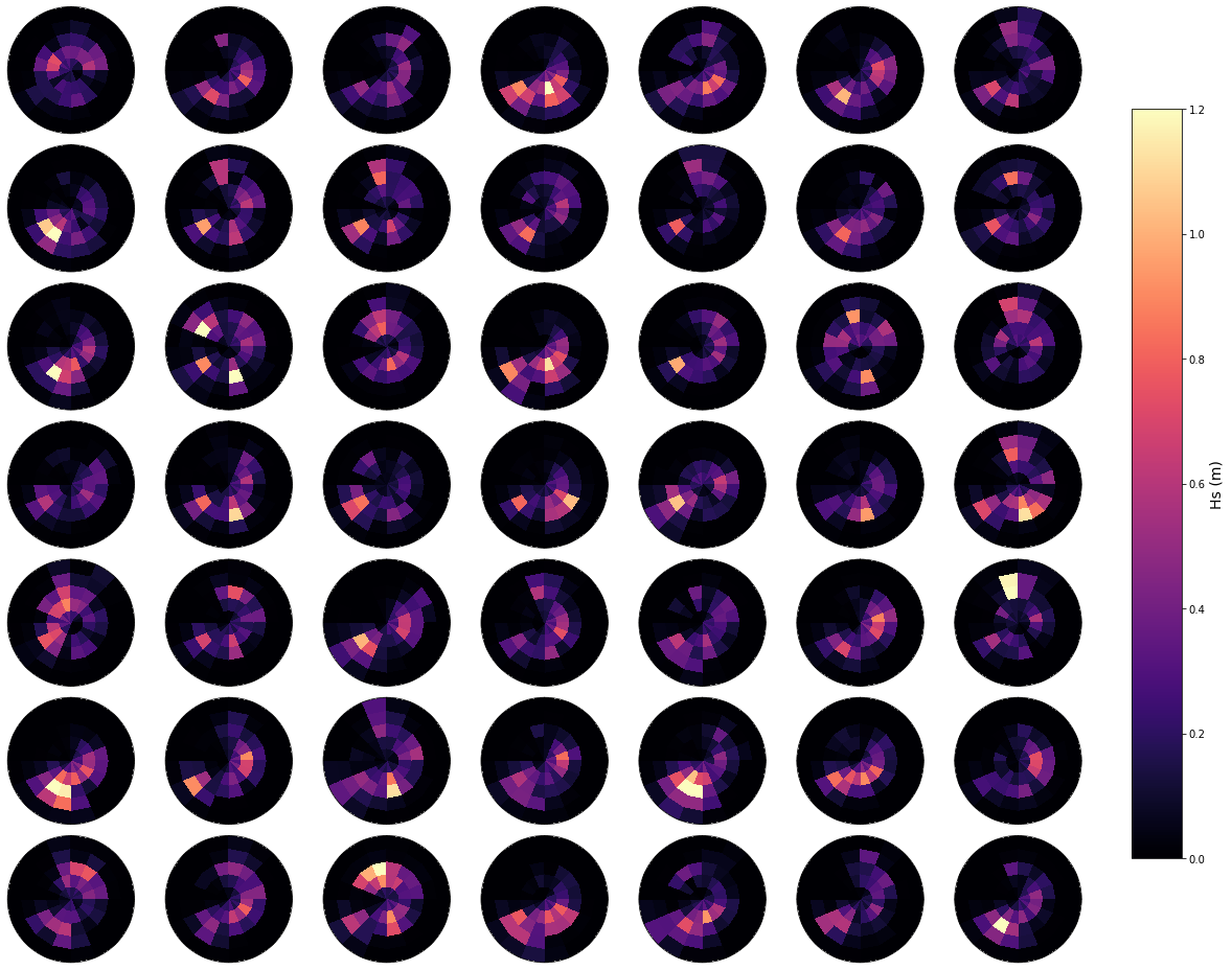
Daily spectrum#
In the plot below, an example of a number of random daily spectrum are plotted, to observe the variability of the waves in the area. Also, the representative bulk Hs is shown.
# resample spectra to daily
sp_mod_daily = sp_mod.resample(time = '1D').mean()
sp_mod_daily = sp_mod_daily.assign_coords(
    t_bins = sp_mod_daily.t.values[0,:],
    dir_bins = sp_mod_daily.dir.values[0,:],
)

# drop t and dir variables
sp_mod_daily = sp_mod_daily.drop(['t', 'dir'])

# store transformed spectra
sp_mod_daily.to_netcdf(p_sp_trans)
Plot_spectra_random_samples(sp_mod_daily, gr = 7);
Principal component analysis#
The PCA is employed to reduce the high dimensionality of the original data space and thus simplify the classification process, transforming the predictor fields into spatial and temporal modes.
PCA projects the original data on a new space searching for the maximum variance of the sample data.
The first 21 PCs are captured, which explain the 95 % of the variability.
m = np.full((len(sp_mod_daily.time), len(sp_mod_daily.dir_bins) * len(sp_mod_daily.t_bins)), 0.000001)
for ti in range(m.shape[0]):
    m[ti, :] = np.ravel(sp_mod_daily.h_t.isel(time = ti).values)
p = 95  # Explained variance

ipca = PCA(n_components = np.shape(m)[1])

# add PCA data to superpoint
sp_mod_daily['PCs'] =  (('time','pc'), ipca.fit_transform(m))
sp_mod_daily['EOFs'] = (('pc','components'), ipca.components_)
sp_mod_daily['pc'] =   range(np.shape(m)[1])
sp_mod_daily['EV'] =   (('pc'), ipca.explained_variance_)

APEV = np.cumsum(sp_mod_daily.EV.values) / np.sum(sp_mod_daily.EV.values) * 100.0
n_pcs = np.where(APEV > p)[0][0]
sp_mod_daily['n_pcs'] = n_pcs

print('Number of PCs explaining {0}% of the EV is: {1}'.format(p, n_pcs))
Number of PCs explaining 95% of the EV is: 24
The PCs represent the temporal variability.
The empirical orthogonal functions, EOFs) of the data covariance matrix define the vectors of the new space.
They represent the spatial variability.
Plot_spectra_hs_pcs(sp_mod_daily, gr = 5);
K-MEANS Clustering#
Daily synoptic patterns are obtained using the K-means clustering algorithm. It divides the data space into 49 clusters, a number that which must be a compromise between an easy handle characterization of the synoptic patterns and the best reproduction of the variability in the data space. Previous works with similar anlaysis confirmed that the selection of this number is adequate (Rueda et al. 2017).
Each cluster is defined by a prototype and formed by the data for which the prototype is the nearest.
Finally the best match unit (bmus) of daily clusters are reordered into a lattice following a geometric criteria, so that similar clusters are placed next to each other for a more intuitive visualization.
# minimun data for each cluster
min_data = np.int(len(sp_mod_daily.time) / num_clusters / min_data_frac)

# KMeans clustering for spectral data
kma, kma_order, bmus, sorted_bmus, centers = kmeans_clustering_pcs(
    sp_mod_daily.PCs.values[:], n_pcs,
    num_clusters,
    min_data = min_data,
    kma_tol = 0.0000000001,
    kma_n_init = 10,
)

# store kma output
pk.dump([kma, kma_order, bmus, sorted_bmus, centers], open(p_kma_spec_model, 'wb'))

# kma, kma_order, bmus, sorted_bmus, centers = pk.load(open(p_kma_spec_model, 'rb'))
# add KMA data to superpoint
sp_mod_daily['kma_order'] =  kma_order
sp_mod_daily['n_pcs'] =  n_pcs
sp_mod_daily['bmus'] = (('time'), sorted_bmus)
sp_mod_daily['centroids'] = (('clusters', 'n_pcs_'), centers)
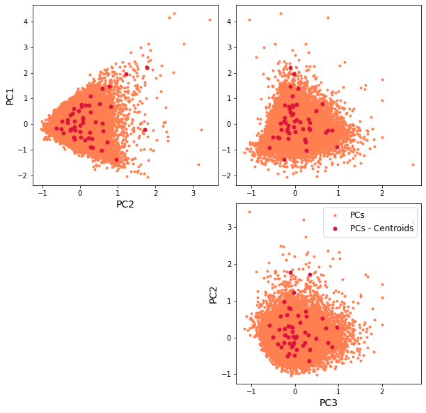
The resulting classification can be seen in the first PCs space, through a scatter plot of PCs and the representative KMA centroids. The obtained centroids (red dots), span the wide variability of the data.
Scatter plot of PCs and the representative KMA centroids:
Plot_pc_space(sp_mod_daily);
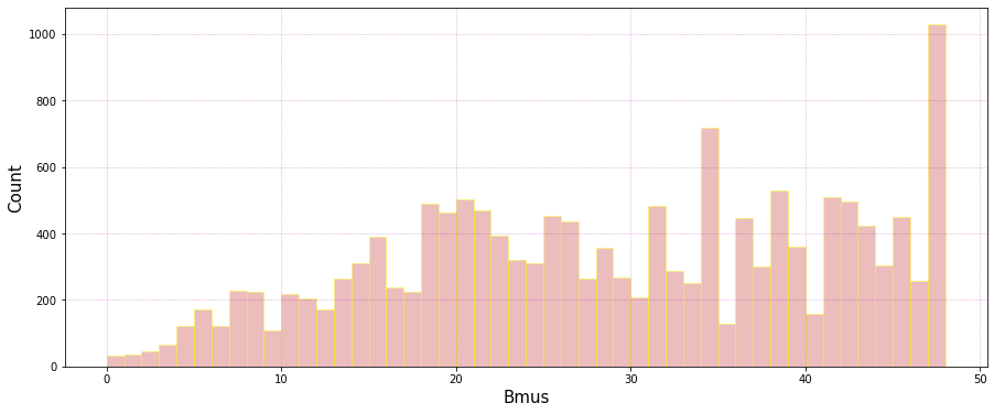
Number of data falling into each cluster:
Plot_bmus_count(sp_mod_daily);
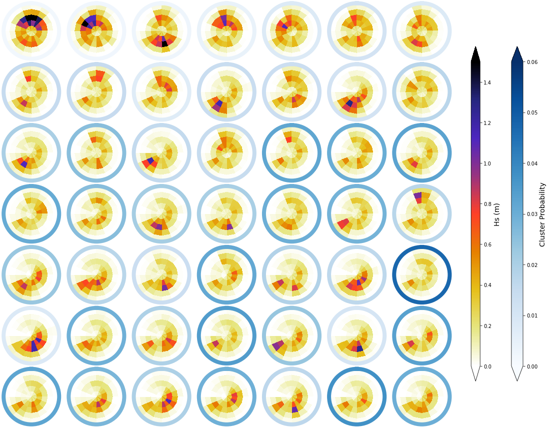
Mean#
The mean spectra associated to each of the different clusters is shown below. The colour of each bin corresponds to the representative Hs, while the scale of blues surrounding each spectra represents the cluster probability
_, mean_h_clust, hs_m = Plot_kmeans_clusters_hs(sp_mod_daily,  vmax=1.5);

# add mean to superpoint h dataset
sp_mod_daily['clusters'] = range(num_clusters)
sp_mod_daily['Mean_h'] = (('t_bins','dir_bins','clusters'), mean_h_clust)
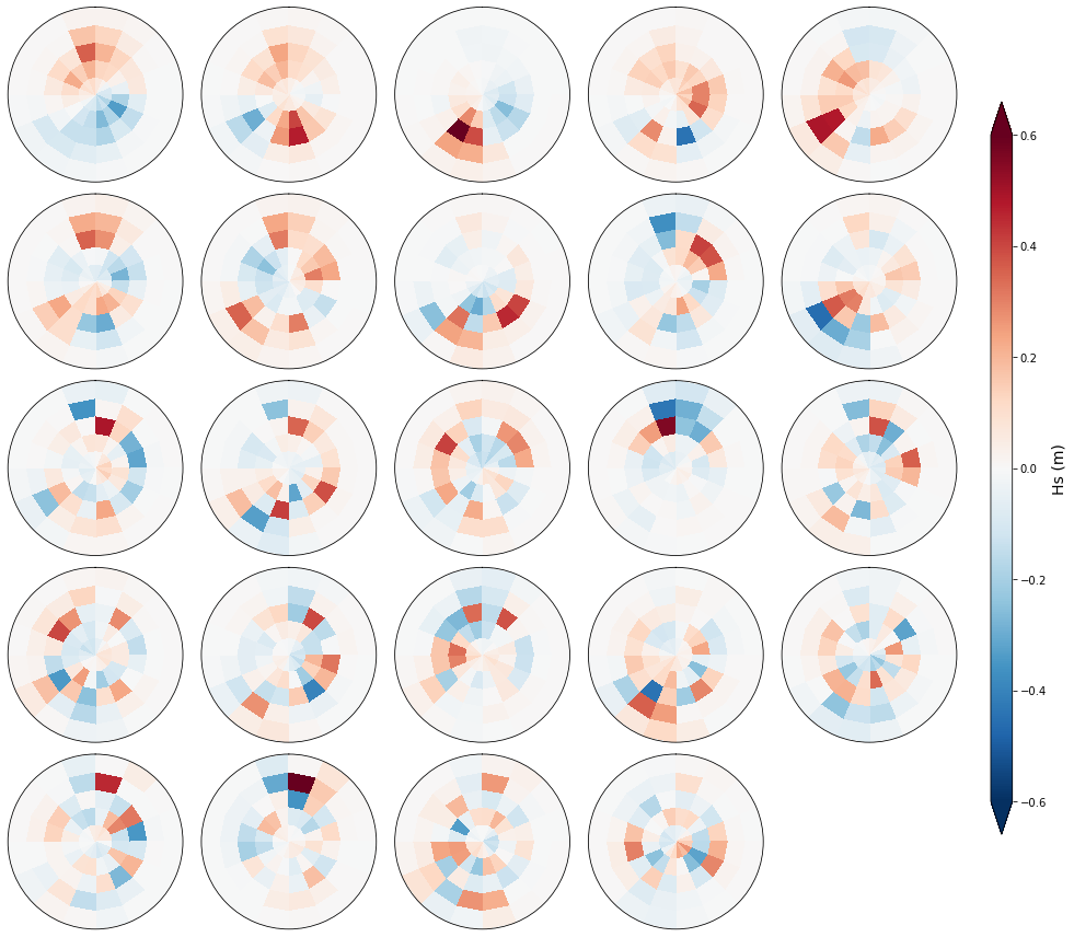
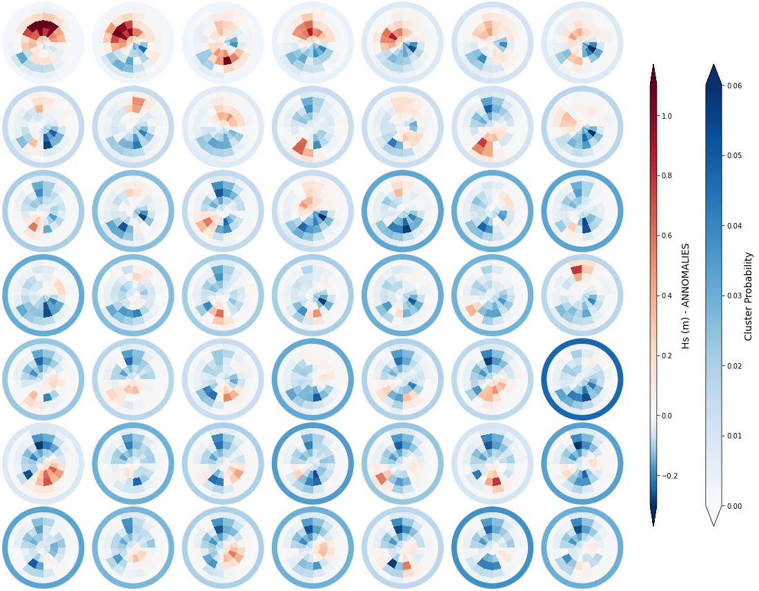
Annomaly#
Below, we are representing the anomaly of each cluster over and above the mean daily spectra for the different clusters. The colour of each bin corresponds to the representative Hs anomaly, while the scale of blues surrounding each spectra represents again the cluster probability
_, annomalies_h_clust, hs_an = Plot_kmeans_clusters_hs(sp_mod_daily, annomaly = True, vmax=1.1);

# add annomaly to superpoint dataset
sp_mod_daily['Annomaly_h'] = (('t_bins','dir_bins','clusters'), annomalies_h_clust)
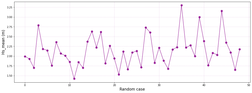
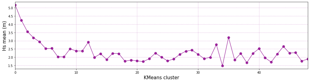
Representative bulk Hs of each KMA Cluster:
# generate figure
plt.figure(figsize = [17, 4])

# plot hs mean for each cluster
plt.plot(range(num_clusters), hs_m,'.-', color='darkmagenta', alpha=0.8, markersize=15)

# customize plot
plt.grid(linestyle = ':', alpha = 0.6, color = 'darkmagenta')
plt.xlabel('KMeans cluster', fontsize = 15)
plt.ylabel('Hs mean (m)', fontsize = 15)
plt.xlim([0, num_clusters - 1])
(0.0, 48.0)
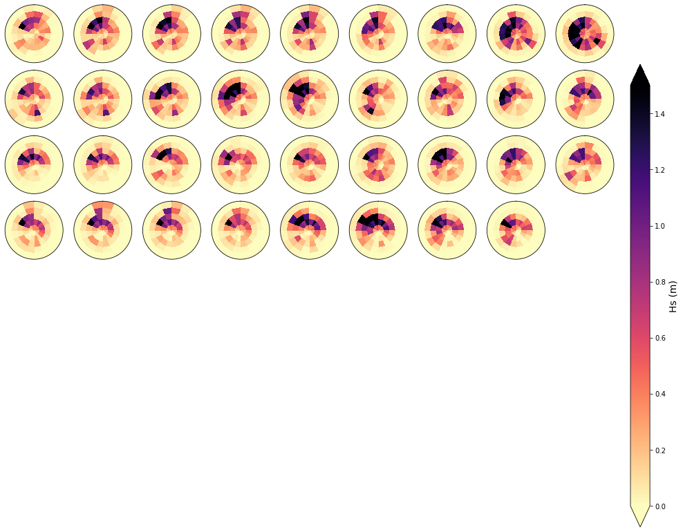
To validate the homogenety of the spectra at each cluster, an example of 81 spectra that fall within one of the clusters is shown below. As can be observed, the homogenety of the data is clear
cluster = 1

Plot_specs_hs_inside_cluster(sp_mod_daily, cluster, gr=9, vmax=1.5);
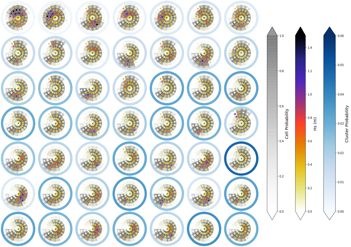
Mean and probability#
To have information not only of the Hs magnitude of each cluster, but also of the probability of having a wave system at each bin, the image below represents with the grey background the cell probability of ocurrence. This gives some inisights on large period swells, that although they have small Hs magnitudes, can have a large probability of occurrence.
# Minimum energy to consider for counting probabilities
h_lim_cont = (0.04 / 4) ** 2

# count probabilities
prob_grid = np.full(np.shape(sp_mod_daily.h), 0.0)
prob_grid[np.where(sp_mod_daily.h > h_lim_cont)] = 1

sp_mod_daily['is_h'] = (('time', 't_bins', 'dir_bins'), prob_grid)
Representation of the Hs at each bin (Point) and its ocurrence probability (background colour):
Plot_kmeans_clusters_probability(sp_mod_daily, vmax_z1=1.5);
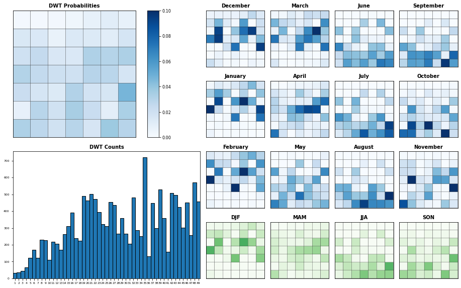
Seasonality#
Probability of each KMA cluster, conditioned to each month and season
#%matplotlib inline
Plot_DWTs_Probs(sp_mod_daily.bmus+1, sp_mod_daily.time.values, num_clusters, vmax=0.09);
# store modified superpoint with KMA data
sp_mod_daily.to_netcdf(p_kma_spec_classification)