17. Matplotlib#
17.1. Overview#
Data visualization is an important part of scientific computing both in analyzing your data and in supporting your conclusions. There are a variety of plotting libraries available in Python, but the one that stands out from the rest is matplotlib. Matplotlib is a core scientific Python library because it is powerful and can generate nearly any plot a user may need. The main drawback is that it is often verbose. That is to say, anything more complex than a very basic plot may require a few lines of boilerplate code to create.
Matplotlib is an outstanding graphics library, designed for scientific computing, with
high-quality 2D and 3D plots
output in all the usual formats (PDF, PNG, etc.)
LaTeX integration
fine-grained control over all aspects of presentation
animation, etc.
17.1.1. Matplotlib’s Split Personality#
Before the first plot can be created, we must first import matplotlib using the below code. This imports the pyplot
module which does much of the basic plotting in matplotlib. While the plt alias is not required, it is a common
convention in the SciPy community and is highly recommended as it will save you a considerable amount of typing.
import matplotlib.pyplot as plt
Matplotlib is unusual in that it offers two different interfaces to plotting.
One is a simple MATLAB-style API (Application Programming Interface) that was written to help MATLAB refugees find a ready home.
The other is a more “Pythonic” object-oriented API.
We recommend that you use the second API.
But first, let’s see the difference.
17.2. The APIs#
17.2.1. The MATLAB-style API#
Here’s the kind of easy example you might find in introductory treatments
import numpy as np
import matplotlib.pyplot as plt
# The following line is not necessary if it is used in a script
%matplotlib inline

x = np.linspace(0, 10, 200)
y = np.sin(x)

plt.plot(x, y, 'b-', linewidth=2)
plt.show()
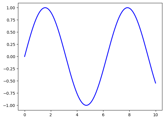
It is necessary execute the following plt.show() function to make the plot appear.
This is simple and convenient, but also somewhat limited and un-Pythonic.
For example, in the function calls, a lot of objects get created and passed around without making themselves known to the programmer.
Python programmers tend to prefer a more explicit style of programming.
This leads us to the alternative, object-oriented Matplotlib API.
17.2.2. The Object-Oriented API#
Here’s the code corresponding to the preceding figure using the object-oriented API
fig, ax = plt.subplots()
ax.plot(x, y, 'b-', linewidth=2)
plt.show()

Here the call fig, ax = plt.subplots() returns a pair, where
figis aFigureinstance—like a blank canvas.axis anAxesSubplotinstance—think of a frame for plotting in.
The plot() function is actually a method of ax.
While there’s a bit more typing, the more explicit use of objects gives us better control.
This will become more clear as we go along.
17.2.3. Tweaks#
Here we’ve changed the line to red and added a legend
fig, ax = plt.subplots()
ax.plot(x, y, 'r-', linewidth=2, label='sine function', alpha=0.6)
ax.legend()
plt.show()
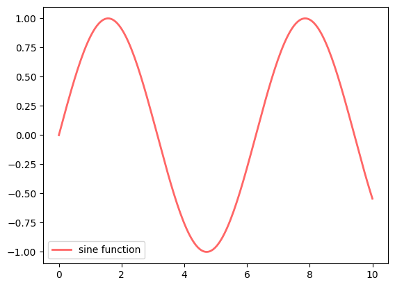
We’ve also used alpha to make the line slightly transparent—which
makes it look smoother.
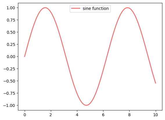
The location of the legend can be changed by replacing ax.legend()
with ax.legend(loc='upper center').
fig, ax = plt.subplots()
ax.plot(x, y, 'r-', linewidth=2, label='sine function', alpha=0.6)
ax.legend(loc='upper center')
plt.show()
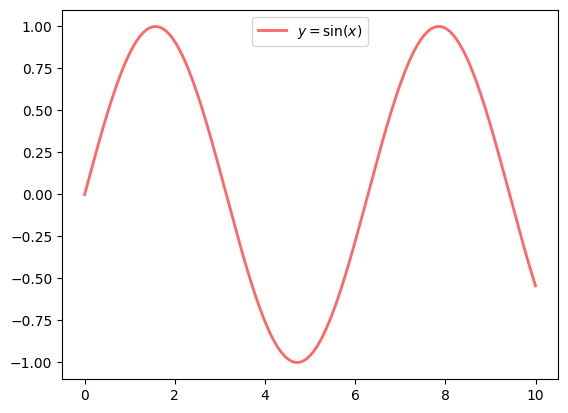
If everything is properly configured, then adding LaTeX is trivial
fig, ax = plt.subplots()
ax.plot(x, y, 'r-', linewidth=2, label='$y=\sin(x)$', alpha=0.6)
ax.legend(loc='upper center')
plt.show()
<>:2: SyntaxWarning: invalid escape sequence '\s'
<>:2: SyntaxWarning: invalid escape sequence '\s'
C:\Users\corcuerp\AppData\Local\Temp\ipykernel_22780\4205971063.py:2: SyntaxWarning: invalid escape sequence '\s'
  ax.plot(x, y, 'r-', linewidth=2, label='$y=\sin(x)$', alpha=0.6)
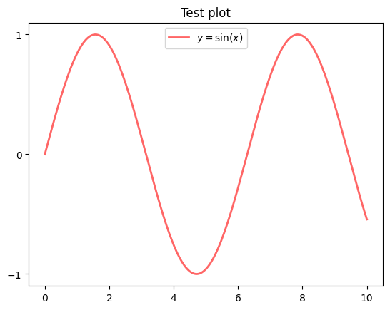
Controlling the ticks, adding titles and so on is also straightforward
fig, ax = plt.subplots()
ax.plot(x, y, 'r-', linewidth=2, label='$y=\sin(x)$', alpha=0.6)
ax.legend(loc='upper center')
ax.set_yticks([-1, 0, 1])
ax.set_title('Test plot')
plt.show()
<>:2: SyntaxWarning: invalid escape sequence '\s'
<>:2: SyntaxWarning: invalid escape sequence '\s'
C:\Users\corcuerp\AppData\Local\Temp\ipykernel_22780\3106301064.py:2: SyntaxWarning: invalid escape sequence '\s'
  ax.plot(x, y, 'r-', linewidth=2, label='$y=\sin(x)$', alpha=0.6)
Another example is to generate data points from orbital radial wave functions. The following equation defines the wave function (\(\psi\)) for the 3s atomic orbital of hydrogen with respect to atomic radius (\(r\)) in Bohrs (\(a_0\)).
We can generate points on this curve using the method of list comprehension. In the code below,
r is the distance from the nucleus and psi_3s is the wave function. To plot something else, just make
two lists or tuples of the same length containing the \(x\)- and \(y\)-values.
# create Python function for generating 3s radial wave function
import math
import matplotlib.pyplot as plt
# The following line is not necessary if it is used in a script
%matplotlib inline

def orbital_3S(r):
    wf = (2/27)*math.sqrt(3)*(2*r**2/9 - 2*r + 3)* math.exp(-r/3)
    return wf

# generate data to plot
r = [num / 4 for num in range(1, 150, 3)]
psi_3s = [orbital_3S(num) for num in r]

plt.plot(r, psi_3s, 'o')
plt.show()
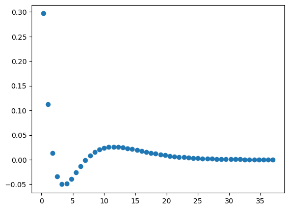
By default, matplotlib creates a scatter plot using blue as the default color. If the plot() function is only
provided a single argument, matplotlib assumes the data are the \(y\)-values and plots them against their indices.
17.3. Configuration#
17.3.1. Components of a Plot (Figure)#
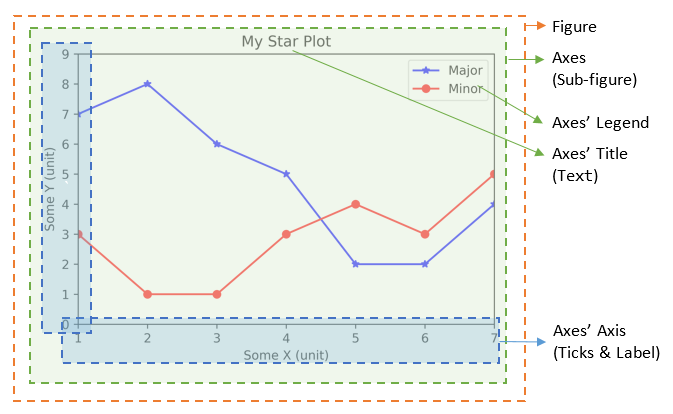
A plot (figure) contains sub-plots (sub-figures) called axes. By default, figure 1, sub-figure 1 is created and set
as the current figure and current axes. All plotting functions like plt.plot(), plt.title(), plt.legend() are applied
on the current figure (figure 1) and current axes (sub-figure 1).
17.3.1.1. Figures, Sub-Figures, and Axes#
A figure (plot) has its own display window. A figure contains sub-figures (sub-plots) called axes. By default, figure 1, subplot 1 is created as the current figure and current axes. Plots are done on the current axes of the current figure by default.
You can use the following functions to create figure and sub-figures (sub-plots), and set the current figure and current sub-plot axes.
figure() -> Figure: start a new figure, with the next running figure number starting from 1.
figure(fig_num) -> Figure: if fig_num does not exist, start a new figure; else set fig_num as the active figure.
subplot(nrows, ncols, index) -> axes: add a sub-plot to the current figure at the index position on a grid with nrows rows and ncols columns. index starts at 1 in the upper left corner and increases to the right.
subplots(nrows=1, ncols=1) -> (Figure, axes_array): Create a figure and a set of subplots with nrows rows and ncols columns. Return the figure and axes handles.
The plotting functions (such as plt.plot(), plt.title()) are applied on the current figure and current axes.
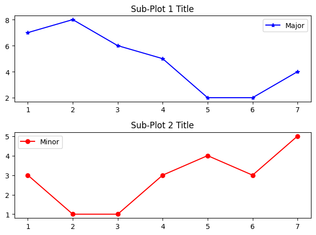
For example,
import matplotlib.pyplot as plt
# The following line is not necessary if it is used in a script
%matplotlib inline

# Start Figure 1. Optional as it is the default.
plt.figure(1)   # Same as plt.figure()
# Start Sub-plot 1 as the current axes
plt.subplot(2, 1, 1)   # 2 rows, 1 column, start subplot 1. Same as plt.subplot(211)
# Plot on the current axes
plt.plot([1, 2, 3, 4, 5, 6, 7], [7, 8, 6, 5, 2, 2, 4], 'b*-', label='Major')
plt.title('Sub-Plot 1 Title')
plt.legend()
# Start Sub-plot 2 as the current axes
plt.subplot(2, 1, 2)   # 2 rows, 1 column, start subplot 2. Same as plt.subplot(212)
# Plot on the current axes
plt.plot([1, 2, 3, 4, 5, 6, 7], [3, 1, 1, 3, 4, 3, 5], 'ro-', label='Minor')
plt.title('Sub-Plot 2 Title')
plt.legend()
plt.tight_layout()   # Prevent subplots overlap
plt.savefig('Plot2x1.png', dpi=600, format='png')  # Save this figure
# Start Figure 2 (on a new window), and set as the current figure
plt.figure(2)
plt.plot([1, 2, 3, 4, 5], [1, 3, 2, 7, 5], 'ro-')  # subplot 1 created automatically as the current axes
plt.show()
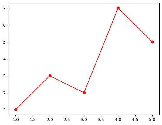
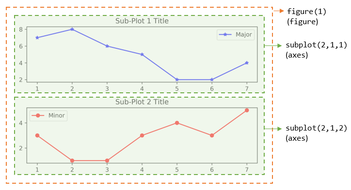
You can also retrieve the handles (references) to the figure and sub-plots (axes), and use the axes in plotting. For example,
import matplotlib.pyplot as plt
# The following line is not necessary if it is used in a script
%matplotlib inline

# Create a figure and sub-plots of 2 rows by 2 columns. Retrieve the handles of figure and subplot axes
fig1, ((ax1, ax2), (ax3, ax4)) = plt.subplots(2, 2)
# Choose the axes for plotting
ax1.plot([1, 2, 3, 4, 5], [1, 3, 2, 7, 5], 'ro-')
ax1.set_title('AX1 Title')
ax2.plot([1, 2, 3, 4, 5], [8, 5, 2, 3, 3], 'gx-')
ax2.set_title('AX2 Title')
ax3.plot([1, 2, 3, 4, 5], [1, 2, 3, 4, 5], 'bo-')
ax3.set_title('AX3 Title')
ax4.plot([1, 2, 3, 4, 5], [5, 4, 3, 2, 1], 'rx-')
ax4.set_title('AX4 Title')
plt.tight_layout()  # Prevent subplots overlap
plt.show()
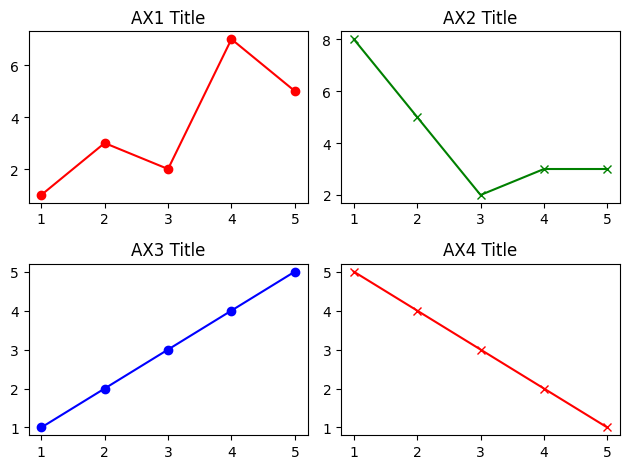
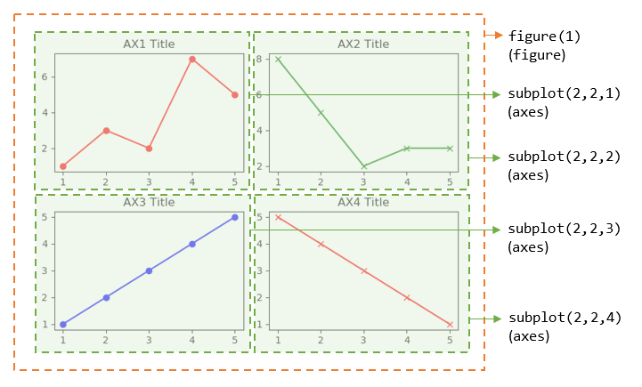
Notes:
For figure with only one sub-plot (axes), use the following to retrieve the figure and axes handles:
fig1, ax1 = plt.subplots() # default one row and one column
You can also use the following functions to retrieve the handle of the current axes and the current figure:
ax = plt.gca()    # Get the current axes handle
fig = plt.gcf()   # Get the current figure handle
You can clear the current figure with plt.clf(), and current axes with plt.cla().
The
plt.show()function clears the current figure and free the memory.
17.3.1.2. The plot() Function#
The plot() has these signatures:
>>> help(plt.plot)
plot([x], y, [fmt], [**kwargs])   # Single line or point
plot([x1], y1, [fmt1], [x2], y2, [fmt2], ..., [**kwargs])  # Multiple lines or points
   # x's and y's can be an array-like structure such as list (line-plot) or a scaler (point-plot)
   # fmt is a format string
For examples,
plot(y): plot y with x=range(len(y))=[0, 1, 2, …, len-1], where y can be an array (line-plot) or a scalar (point-plot).
plot(x, y): plot y against x, where x and y can be an array (line-plot) or a scalar (point-plot)
plot(x, y, fmt): plot y against x using the format string, e.g., ‘bo-’ for blue circle solid-line, ‘r+’ for red pluses.
plot(x1, y1, fmt1, x2, y2, fmt2, …): plot yn vs. xn using the respective format strings (multiple lines or multiple points).
17.3.2. Markers and Color#
To change the color and markers, you can add a few extra arguments: marker, linestyle, and color. All of these
keyword arguments take strings. The marker argument allows the user to choose from a list of markers (Table 1). The
linestyle argument (Table 2) determines if a line is solid or the type of dashing that occurs, and the color argument
(Table 3) allows the user to dictate the color of the line/markers. If an empty string is provided to linestyle or
marker, no line or marker, respectively, is included in the plot. See the matplotlib website
for a more complete list of styles.
Table 1 Common Matplotlib Marker Styles
Argument |
Description |
|---|---|
‘o’ |
circle |
‘*’ |
star |
‘p’ |
pentagon |
‘^’ |
triangle-up |
‘v’ |
triangle-down |
‘s’ |
square |
‘h’ |
hexagon |
‘x’ |
cross |
‘.’ |
point |
‘,’ |
pixel |
‘+’ |
plus |
‘d’ |
diamond |
‘ |
‘ |
‘_’ |
hline |
Table 2 Common Matplotlib Line Styles
Argument |
Description |
|---|---|
‘-’ |
solid |
‘–’ |
dashed |
‘-.’ |
dash-dot |
‘:’ |
dotted |
Table 3 Common Matplotlib Colors
Argument |
Description |
|---|---|
‘b’ |
blue |
‘r’ |
red |
‘k’ |
black (key) |
‘g’ |
green |
‘m’ |
magenta |
‘c’ |
cyan |
‘y’ |
yellow |
‘w’ |
white |
There are numerous other arguments that can be placed in the plot command. A few common, useful ones are shown below in Table 4.
Table 4 A Few Common plot Keyword Arguments
Argument |
Description |
|---|---|
|
line style |
|
marker style |
|
line width |
|
line color |
|
marker edge color |
|
marker color |
|
marker size |
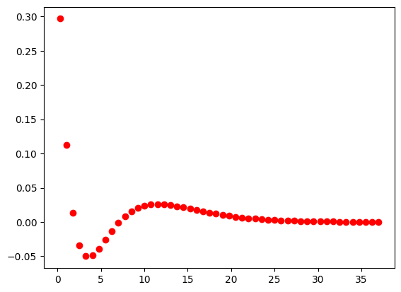
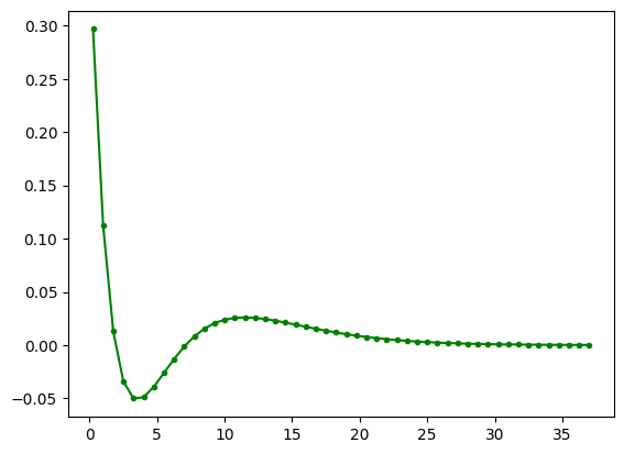
The plot function can take a third, positional argument which makes plotting a lot quicker. If you place a string with a marker style and/or line style, you can adjust the color and markers without the full keyword arguments. This approach does not allow the user as much control as the keyword arguments, but it is popular because of the brevity.
# ro = red circle
plt.plot(r, psi_3s, 'ro');
plt.plot(r, psi_3s, 'g.-');
17.3.3. Labels#
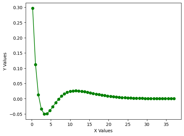
It is often important to label the axes of your plot. This is accomplished using the plt.xlabel() and plt.ylabel()
functions which are placed on different lines as the plt.plot() function. Both functions take strings.
plt.plot(r, psi_3s, 'go-')
plt.xlabel('X Values')
plt.ylabel('Y Values');
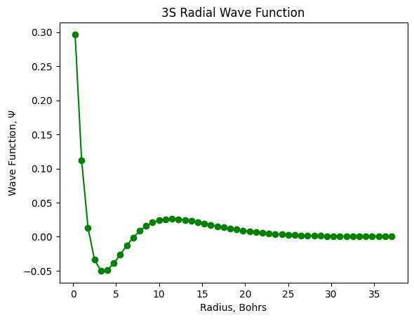
In the event you want a title at the top of your plots, you can add one using the plt.title() argument. To add
symbols to the axes, this can be done using Latex commands which are used below.
plt.plot(r, psi_3s, 'go-')
plt.xlabel('Radius, Bohrs')
plt.ylabel('Wave Function, $\Psi$')
plt.title('3S Radial Wave Function');
<>:3: SyntaxWarning: invalid escape sequence '\P'
<>:3: SyntaxWarning: invalid escape sequence '\P'
C:\Users\corcuerp\AppData\Local\Temp\ipykernel_22780\2141232160.py:3: SyntaxWarning: invalid escape sequence '\P'
  plt.ylabel('Wave Function, $\Psi$')
There are another functions with Text object:
text(xPos, yPos, str): Draws str at (xPos, yPos).
annotate(str, xy=(x, y), xytext=(x, y)): Annotate for the point at xy, with str placed at xytext, with an optional arrow.
17.3.4. Logarithmic and Non-Linear Axis#
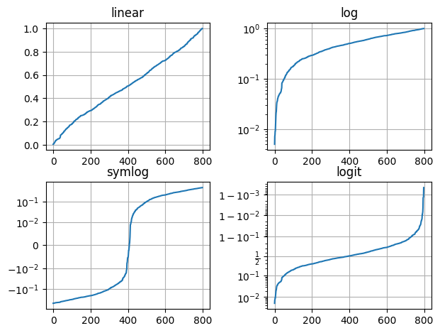
xscale(scale), yscale(scale): the available scales are ‘linear’, ‘log’, ‘symlog’ (symmetric log).
Example:
import matplotlib.pyplot as plt
# The following line is not necessary if it is used in a script
%matplotlib inline
import numpy as np

# matplotlib.pyplot supports not only linear axis scales, but also
# logarithmic and logit scales. This is commonly used if data spans many orders
# of magnitude. Changing the scale of an axis is easy:
#
#     plt.xscale('log')
#
# An example of four plots with the same data and different scales for the y axis
# is shown below.

# Fixing random state for reproducibility
np.random.seed(19680801)

# make up some data in the open interval (0, 1)
y = np.random.normal(loc=0.5, scale=0.4, size=1000)
y = y[(y > 0) & (y < 1)]
y.sort()
x = np.arange(len(y))

# plot with various axes scales
plt.figure()

# linear
plt.subplot(221)
plt.plot(x, y)
plt.yscale('linear')
plt.title('linear')
plt.grid(True)

# log
plt.subplot(222)
plt.plot(x, y)
plt.yscale('log')
plt.title('log')
plt.grid(True)

# symmetric log
plt.subplot(223)
plt.plot(x, y - y.mean())
plt.yscale('symlog', linthresh=0.01)
plt.title('symlog')
plt.grid(True)

# logit
plt.subplot(224)
plt.plot(x, y)
plt.yscale('logit')
plt.title('logit')
plt.grid(True)
# Adjust the subplot layout, because the logit one may take more space
# than usual, due to y-tick labels like "1 - 10^{-3}"
plt.subplots_adjust(top=0.92, bottom=0.08, left=0.10, right=0.95, hspace=0.25,
                    wspace=0.35)

plt.show()
17.3.5. Figure Size#
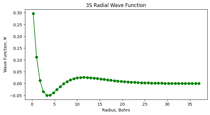
If you want to change the size or dimensions of the figure, this can be accomplished by
plt.figure(figsize=(width, height)). It is important that this function be above the the actual plotting function
and not below for it to modify the figure.
plt.figure(figsize=(8,4))
plt.plot(r, psi_3s, 'go-')
plt.xlabel('Radius, Bohrs')
plt.ylabel('Wave Function, $\Psi$')
plt.title('3S Radial Wave Function');
<>:4: SyntaxWarning: invalid escape sequence '\P'
<>:4: SyntaxWarning: invalid escape sequence '\P'
C:\Users\corcuerp\AppData\Local\Temp\ipykernel_22780\4108098500.py:4: SyntaxWarning: invalid escape sequence '\P'
  plt.ylabel('Wave Function, $\Psi$')
17.3.6. Saving Figures#
There are times when it is necessary to save the figures to files for a manuscript, report, or presentation.
In these situations, you can save your plot using the plt.savefig() function which takes a few arguments.
The first and only required argument is the name of the output file as a string. Following this, the user can
also choose the resolution in dots per inch using the dpi keyword argument. Finally, there are a number of file
formats supported by the plt.savefig() functions including PNG, TIF, JPG, PDF, SVG, among others. The formats
can be selected using the format argument which also takes a string, and if no format is explicitly chosen,
matplotlib defaults to PNG.
plt.plot(r, psi_3s, 'g.-')
plt.savefig('my_image.png', format='PNG', dpi=600);

17.4. More Features#
Matplotlib has a huge array of functions and features.
We mention just a few.
17.4.1. Multiple Plots on One Axis#
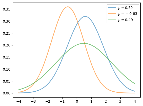
It’s straightforward to generate multiple plots on the same axes.
Here’s an example that randomly generates three normal densities and adds a label with their mean
from scipy.stats import norm
from random import uniform

fig, ax = plt.subplots()
x = np.linspace(-4, 4, 150)
for i in range(3):
    m, s = uniform(-1, 1), uniform(1, 2)
    y = norm.pdf(x, loc=m, scale=s)
    current_label = f'$\mu = {m:.2}$'
    ax.plot(x, y, linewidth=2, alpha=0.6, label=current_label)
ax.legend()
plt.show()
<>:9: SyntaxWarning: invalid escape sequence '\m'
<>:9: SyntaxWarning: invalid escape sequence '\m'
C:\Users\corcuerp\AppData\Local\Temp\ipykernel_22780\3917968170.py:9: SyntaxWarning: invalid escape sequence '\m'
  current_label = f'$\mu = {m:.2}$'
17.4.2. Multiple Subplots#
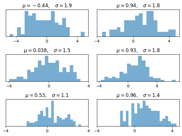
Sometimes we want multiple subplots in one figure.
Here’s an example that generates 6 histograms
num_rows, num_cols = 3, 2
fig, axes = plt.subplots(num_rows, num_cols)
for i in range(num_rows):
    for j in range(num_cols):
        m, s = uniform(-1, 1), uniform(1, 2)
        x = norm.rvs(loc=m, scale=s, size=100)
        axes[i, j].hist(x, alpha=0.6, bins=20)
        t = f'$\mu = {m:.2}, \quad \sigma = {s:.2}$'
        axes[i, j].set(title=t, xticks=[-4, 0, 4], yticks=[])

plt.tight_layout()
plt.show()
<>:8: SyntaxWarning: invalid escape sequence '\m'
<>:8: SyntaxWarning: invalid escape sequence '\q'
<>:8: SyntaxWarning: invalid escape sequence '\m'
<>:8: SyntaxWarning: invalid escape sequence '\q'
C:\Users\corcuerp\AppData\Local\Temp\ipykernel_22780\4079430947.py:8: SyntaxWarning: invalid escape sequence '\m'
  t = f'$\mu = {m:.2}, \quad \sigma = {s:.2}$'
C:\Users\corcuerp\AppData\Local\Temp\ipykernel_22780\4079430947.py:8: SyntaxWarning: invalid escape sequence '\q'
  t = f'$\mu = {m:.2}, \quad \sigma = {s:.2}$'
17.4.3. 3D Plots#
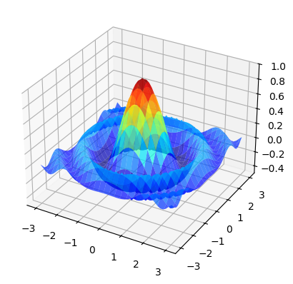
Matplotlib does a nice job of 3D plots — here is one example
from mpl_toolkits.mplot3d.axes3d import Axes3D
from matplotlib import cm


def f(x, y):
    return np.cos(x**2 + y**2) / (1 + x**2 + y**2)

xgrid = np.linspace(-3, 3, 50)
ygrid = xgrid
x, y = np.meshgrid(xgrid, ygrid)

fig = plt.figure()
ax = fig.add_subplot(111, projection='3d')
ax.plot_surface(x,
                y,
                f(x, y),
                rstride=2, cstride=2,
                cmap=cm.jet,
                alpha=0.7,
                linewidth=0.25)
ax.set_zlim(-0.5, 1.0)
plt.show()
17.4.4. A Customizing Function#
Perhaps you will find a set of customizations that you regularly use.
Suppose we usually prefer our axes to go through the origin, and to have a grid.
Here’s a nice example
of how the object-oriented API can be used to build a custom subplots
function that implements these changes.
Read carefully through the code and see if you can follow what’s going on
def subplots():
    "Custom subplots with axes through the origin"
    fig, ax = plt.subplots()

    # Set the axes through the origin
    for spine in ['left', 'bottom']:
        ax.spines[spine].set_position('zero')
    for spine in ['right', 'top']:
        ax.spines[spine].set_color('none')

    ax.grid()
    return fig, ax


fig, ax = subplots()  # Call the local version, not plt.subplots()
x = np.linspace(-2, 10, 200)
y = np.sin(x)
ax.plot(x, y, 'r-', linewidth=2, label='sine function', alpha=0.6)
ax.legend(loc='lower right')
plt.show()
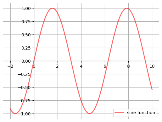
The custom subplots function
calls the standard
plt.subplotsfunction internally to generate thefig, axpair,makes the desired customizations to
ax, andpasses the
fig, axpair back to the calling code.
17.4.5. Example#
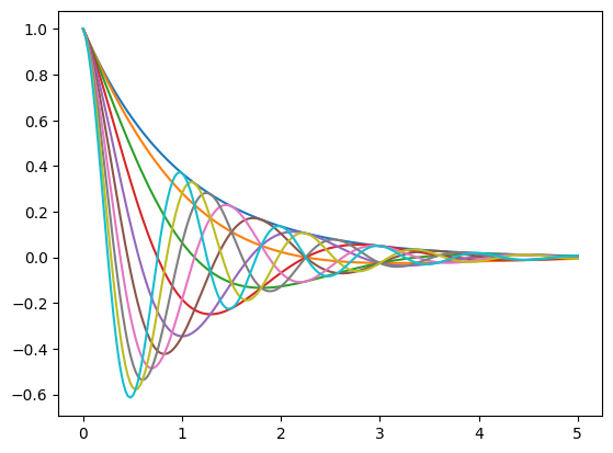
Plot the function
over the interval \([0, 5]\) for each \(\theta\) in np.linspace(0, 2, 10).
Place all the curves in the same figure.
Solution
Here’s one solution
def f(x, θ):
    return np.cos(np.pi * θ * x ) * np.exp(- x)

θ_vals = np.linspace(0, 2, 10)
x = np.linspace(0, 5, 200)
fig, ax = plt.subplots()

for θ in θ_vals:
    ax.plot(x, f(x, θ))

plt.show()
17.5. Plotting Types#
Matplotlib supports a wide variety of plotting types including scatter plots, bar plots, histograms, pie charts, stem plots, and many others. A few of the most common ones are introduced below. For additional plotting types, see the matplotlib website.
17.5.1. Bar Plots#
Bar plots, despite looking very different, are quite similar to scatter plots. They both show the same information
except that instead of the verticle position of a marker showing the magnitude of a \(y\)-value, it is represented by
the height of a bar. Bar plots are generated using the plt.bar() function. Similar to the plt.plot() function,
the bar plot takes \(x\)- and \(y\)-values as positional arguments, and if only one argument is given, the function assumes
it is the \(y\)-variables and plots the values with respect to the index values.
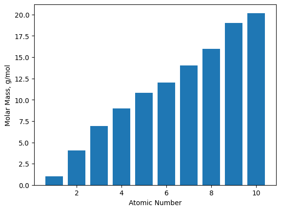
The atomic numbers (AN) for the first ten chemical elements are generated below using list comprehension to be plotted
with the molecular weights (MW).
AN = [x + 1 for x in range(10)]
MW = [1.01, 4.04, 6.94, 9.01, 10.81, 12.01, 14.01, 16.00, 19.00, 20.18]

plt.bar(AN, MW)
plt.xlabel('Atomic Number')
plt.ylabel('Molar Mass, g/mol');
The bar plot characteristics can be adjusted like most other types of plots in matplotlib. The main arguments you
will probably want to adjust are color and width, but some other arguments are provided in Table 5. The color
arguments are consistent with the plt.plot() colors from earlier. The error bar arguments can take either a
single value to display homogenous error bars on all data points or can take a multi-element object
(e.g., a list or tuple) containing the different margins of uncertainty for each data point.
Table 5 A Few Common plot Keyword Arguments
Argument |
Description |
|---|---|
|
bar width |
|
bar color |
|
bar edge color |
|
X error bar |
|
Y error bar |
|
caps on error bars |
17.5.2. Scatter Plots#
We have already generated scatter plots using the plt.plot() function, but they can also be created using the
plt.scatter() function. The latter is partially redundant, but unlike plt.plot(), plt.scatter() allows for
different sizes, shapes, and colors of individual markers using the s=, marker=, and c= keyword arguments,
respectively. Links to more complete lists can be found in the Further Reading section.
In the example below, we are loading the famous wine data set that
describes wine samples through a number of measurements including alcohol content, magnesium levels, color, etc…
For convenience, we will load the data set using the scikit-learn library. We then plot it and include a third
attribute to the color c= argument.
wine = np.loadtxt('data/wine.txt')

plt.scatter(wine[:,0], wine[:,5], c=wine[:,12])
plt.xlabel('Alcohol Content')
plt.ylabel('Alkalinity of Ash')
plt.colorbar();
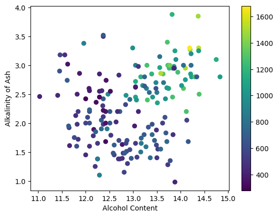
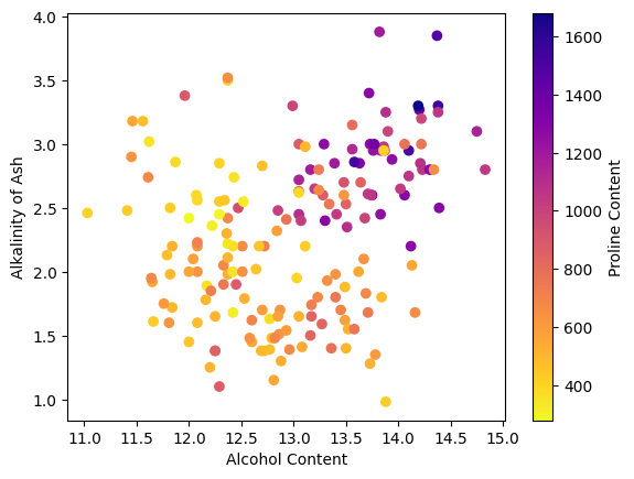
In the example above, the alcohol content is represented on the \(x\)-axis, the alkalinity is represented on the \(y\)-axis,
and the proline content is shown using the color of the markers. The spectrum of colors that represent the values is
called the colormap, and this can be changed using an optional cmap= argument. See the matplotlib colormap page for a list of available colormaps.
The plt.colorbar() provides a guide as to the meaning of the colors, but it would be nice to also have a text label
on the color bar just like the axes. This can be accomplished by assigning the color bar to a varible and then using
the set_label() attribute to add a label as demonstrated below.
plt.scatter(wine[:,0], wine[:,5], c=wine[:,12], cmap='plasma_r')
plt.xlabel('Alcohol Content')
plt.ylabel('Alkalinity of Ash')

cbar = plt.colorbar()
cbar.set_label('Proline Content');
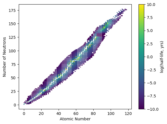
As an additional example, we can generate a plot of nuclide atomic numbers versus the number of neutrons and color the markers with the log of the half-life, in years, of each nuclide.
import numpy as np
nuc = np.genfromtxt('data/nuclide.csv', delimiter=',', skip_header=1)

plt.scatter(nuc[:,0], nuc[:,1], s=1, marker='s', c=nuc[:,2], cmap='viridis')
plt.xlabel('Atomic Number')
plt.ylabel('Number of Neutrons')
cbar = plt.colorbar()
cbar.set_label('log(half-life, yrs)');
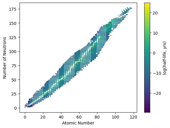
One of the issues we encounter in the above plot is that the range of half-lives is large with relatively few points in the extreme ends. We can see this in the histogram plot of these log half-life values shown below.
plt.hist(nuc[:,2], bins=20, edgecolor='k')
plt.xlabel('Log Half-Life, yrs')
plt.ylabel('Counts');
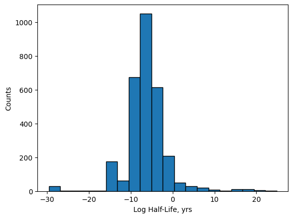
In order to prevent the few values at the extremes from effectively washing out the color and making it difficult
to see the differences, we can use the plt.scatter() arguments vmax= and vmin= to narrow the colormap range
like shown below. By doing this, any values above the vmax= value will be a fixed color, and any values below
the vmin= value with be a fixed color.
plt.scatter(nuc[:,0], nuc[:,1], s=1, marker='s', c=nuc[:,2],
            cmap='viridis', vmax=10, vmin=-10)
plt.xlabel('Atomic Number')
plt.ylabel('Number of Neutrons')
cbar = plt.colorbar()
cbar.set_label('log(half-life, yrs)');
17.5.3. Histogram Plots#
Histograms display bars representing the frequency of values in a particular data set. Unlike bar plots, the width
of the bars in a histogram plot is meaningful as each bar represents the number of \(x\)-values that fall within a
particular range. A histogram plot can be generated using the plt.hist() function which does two things. First,
the function takes the data provided and sorts them into equally-spaces groups, called bins; and second, it plots
the totals in each bin. For example, we have a list, Cp, of specific heat capacities for various metals in J/g\(\cdot^o\)C,
and we want to visualize the distribution of the specific heat capacities.
Cp = [0.897, 0.207, 0.231, 0.231, 0.449, 0.385, 0.129,
      0.412, 0.128, 1.02, 0.140, 0.233, 0.227, 0.523,
      0.134, 0.387]

plt.hist(Cp, bins=10, edgecolor='k')
plt.xlabel('Heat Capacity, J/gC')
plt.ylabel('Number of Metals');
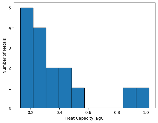
From the plot above, we can see that a large number of heat capacities reside in the area of 0.1-0.5 J/g\(\cdot^o\)C and none fall in the 0.6-0.8 J/g\(\cdot^o\)C range.
The two main arguments for the plt.hist(data, bins=) function are data and bins. The bins argument can be either
a number of evenly-spaced bins in which the data is sorted, like above, or it can be a list of bin edges like below. The
function automatically determines which you are providing based on your input.
plt.hist(Cp, bins=[0, 0.2, 0.4, 0.6, 0.8, 1.0], edgecolor='k')
plt.xlabel('Heat Capacity, J/gC')
plt.ylabel('Number of Metals');
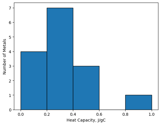
Providing the histogram function bin edges offers far more control to the user, but writing out a list can be tedious.
As an alternative, the histogram function also accepts bin edges as range() objects. Unfortunately, Python’s built-in
range() function only generates values with integer steps. As an alternative, you can use list comprehension or use
NumPy’s np.arange() function which does allow non-integer step sizes.
17.5.4. Other Plotting Types#
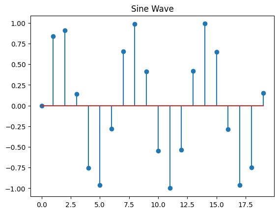
There are a variety of other two dimensional plotting types available in the matplotlib library including stem, step, pie, polar, box plots, and contour plots. Below is a table of a few worth knowing about along with the code that created them. See the matplotlib website for further details. Many Python library websites, including matplotlib’s, contain a gallery page which showcases examples of what can be done with that library. It is recommended to browse these pages when learning a new library.
stem
x = range(20)
y = [math.sin(num) for num in x]
plt.stem(x, y)
plt.title('Sine Wave');
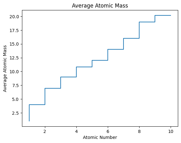
step
AN = range(1, 11)
mass_avg = [1.01, 4.00, 6.94, 9.01,
10.81, 12.01, 14.01, 16.00, 19.00,
20.18]
plt.step(AN, mass_avg)
plt.title('Average Atomic Mass')
plt.xlabel('Atomic Number')
plt.ylabel('Average Atomic Mass');
pie
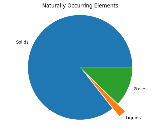
labels = ['Solids', 'Liquids','Gases']
percents = (85.6, 2.2, 12.2)
plt.title('Naturally Occurring Elements')
plt.pie(percents, labels=labels,
explode=(0, 0.2, 0))
plt.axis('equal');
polar
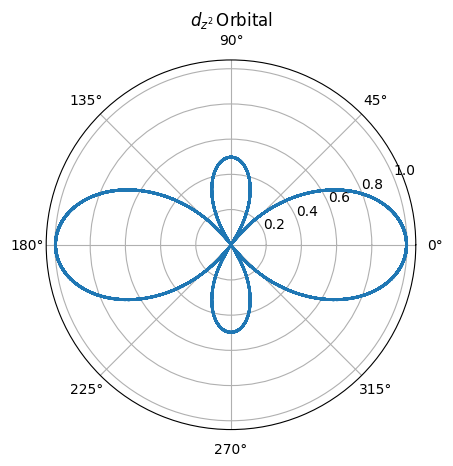
import numpy as np
theta = np.arange(0, 360,0.1)
r = [abs(0.5 * (3 * math.cos(num)**2
-           1)) for num in theta]
plt.polar(theta, r)
plt.title(r'$d_{z^2} \,$' + 'Orbital');
17.5.5. Overlaying Plots#
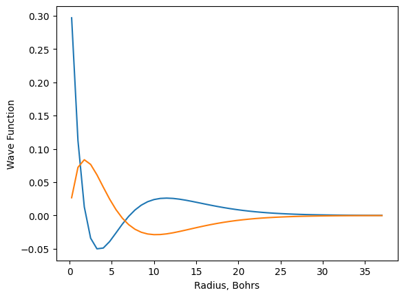
It is often necessary to plot more than one set of data on the same axes, and this can be accomplished in two ways with matplotlib. The first is to call the plotting function twice in the same code cell. Matplotlib will automatically place both plots in the same figure and scale it appropriately to include all data. Below, data for the wave function for the 3p hydrogen orbital is generated similar to the 3s earlier, so now the wave functions for both the 3s and 3p orbitals can be plotted on the same set of axes.
def orbital_3P(r):
    wf = (math.sqrt(6)*r*(4-(2/3)*r)*math.e**(-r/3))/81
    return wf

r = [num / 4 for num in range(1, 150, 3)]
psi_3p = [orbital_3P(num) for num in r]

plt.plot(r, psi_3s)
plt.plot(r, psi_3p)
plt.xlabel('Radius, Bohrs')
plt.ylabel('Wave Function');
The second approach is to include both sets of data in the same plotting command as is shown below. Matplotlib will assume that each new non-keyword is a new set of data and that the positional arguments are associated with the most recent data.
plt.plot(r, psi_3s, 'bo', r, psi_3p,'r^')
plt.xlabel('Radius, Bohrs')
plt.xlabel('Radius, Bohrs')
plt.ylabel('Wave Function');
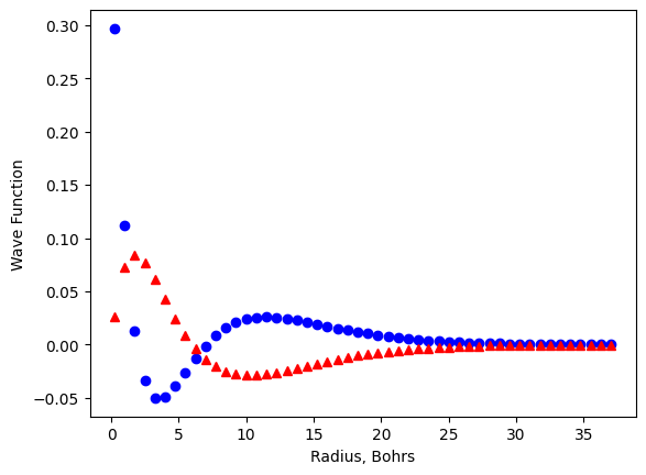
In the second plot above, r, psi_3s, 'bo' are the data and style for the first set of data while r, psi_3p,'r^'
are the data and plotting style for the second.
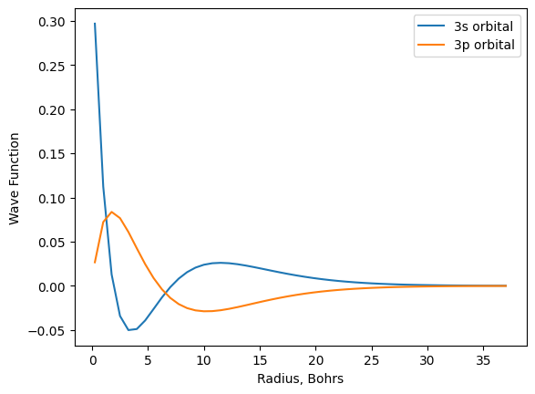
One issue that quickly arrises with multifigure plots is identifying which symbols belong to which data. Matplotlib
allows the user to add a legend to the plot. The user first needs to provide a label for each data set using the
label= keyword argument. Finally, calling plt.legend() causes the labels to be displayed on the plot. The default
is for matplotlib to place the legend where it decides is the optimal location, but this behavior can be overridden by
adding a keyword loc= argument. A complete list of location arguments are available on the matplotlib website.
plt.plot(r, psi_3s, label='3s orbital')
plt.plot(r, psi_3p, label='3p orbital')
plt.xlabel('Radius, Bohrs')
plt.ylabel('Wave Function')
plt.legend();
17.5.6. Multifigure Plots#
To generate multiple, independent plots in the same figure, a few more lines of code are required to describe the dimensions of the figure and which plot goes where. Once you get used to it, it is fairly logical. There are two general methods for generating multifigure plots outlined below. The first is a little quicker, but the second is certainly more powerful and gives the user access to extra features. Whichever method you choose to adopt, just be aware that you will likely see the other method at times as both are common.
17.5.6.1. First Approach#
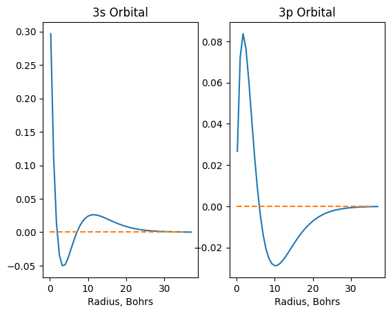
In the first method, we first need to generate the figure using the plt.figure() command. For every subplot, we
first need to call plt.subplot(rows, columns, plot_number). The first two values are the number of rows and columns
in the figure, and the third number is which subplot you are referring to. For example, we will generate a figure with
two plots side-by-side. This is a one-by-two figure (i.e., one row and two columns). Therefore, all subplots will be defined using plt.subplot(1, 2, plot_number). The plot_number indicates the subplot with the first subplot being 1 and the second subplot being 2.
The numbering always runs left-to-right and top-to-bottom.
plt.figure()

plt.subplot(1,2,1) # first subplot
plt.plot(r, psi_3s)
plt.hlines(0, 0, 35, linestyle='dashed', color='C1')
plt.xlabel('Radius, Bohrs')
plt.title('3s Orbital')

plt.subplot(1,2,2) # second subplot
plt.plot(r, psi_3p)
plt.hlines(0, 0, 35, linestyle='dashed', color='C1')
plt.xlabel('Radius, Bohrs')
plt.title('3p Orbital');
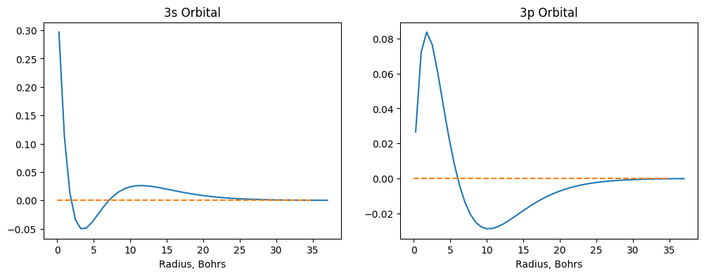
If you don’t like dimensions of your plot, you can still change them using a figsize=(width, height) argument in
figure() function like the following.
plt.figure(figsize=(12,4))

plt.subplot(1,2,1) # first subplot
plt.plot(r, psi_3s)
plt.hlines(0, 0, 35, linestyle='dashed', color='C1')
plt.xlabel('Radius, Bohrs')
plt.title('3s Orbital')

plt.subplot(1,2,2) # second subplot
plt.plot(r, psi_3p)
plt.hlines(0, 0, 35, linestyle='dashed', color='C1')
plt.xlabel('Radius, Bohrs')
plt.title('3p Orbital');
The values in the plt.subplot() command may seem redundant. Why are the dimensions for the figure repeatedly defined
instead of just once? The answer is that subplots with different dimensions can be created in the same figure (Figure 1).
In this example, the top subplot dimension is created as if though it is the first subplot in a 2 \(\times\) 1 figure. The
bottom two subplot dimensions are created as if they are the third and fourth subplots in a 2 \(\times\) 2 figure.
Figure 1 Multifigure plots with subplots of different dimensions (right) describe each subplot dimension as if it were part of a plot with equally sized subplots (left).
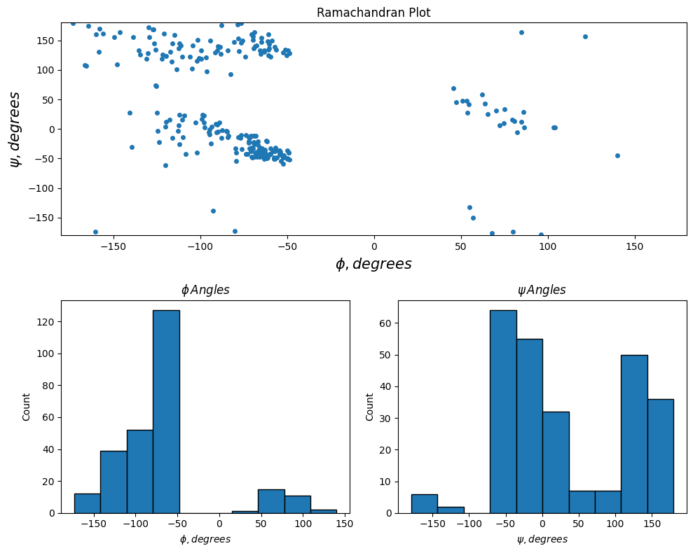
In the following example, dihedral angle data contained in a hydrogenase enzyme from Nat. Chem. Biol. 2016, 12, 46-50 is important and displayed. The top plot shows the relationship between the psi (\(\psi\)) and phi (\(\phi\)) angles while the bottom two plots show the distribution of psi and phi angles using histogram plots.
rama = np.genfromtxt('data/hydrogenase_5a4m_phipsi.csv',
                     delimiter=',', skip_header=1)

psi = rama[:,0]
phi = rama[:,1]

plt.figure(figsize=(10,8))

plt.subplot(2,1,1)
plt.plot(phi, psi, '.', markersize=8)
plt.xlim(-180, 180)
plt.ylim(-180, 180)
plt.xlabel('$\phi, degrees$', fontsize=15)
plt.ylabel('$\psi, degrees$', fontsize=15)
plt.title('Ramachandran Plot')

plt.subplot(2,2,3)
plt.hist(phi[1:], edgecolor='k')
plt.xlabel('$\phi, degrees$')
plt.ylabel('Count')
plt.title('$\phi \, Angles$')

plt.subplot(2,2,4)
plt.hist(psi[:-1], edgecolor='k')
plt.xlabel('$\psi, degrees$')
plt.ylabel('Count')
plt.title('$\psi \, Angles$')

plt.tight_layout();
<>:13: SyntaxWarning: invalid escape sequence '\p'
<>:14: SyntaxWarning: invalid escape sequence '\p'
<>:19: SyntaxWarning: invalid escape sequence '\p'
<>:21: SyntaxWarning: invalid escape sequence '\p'
<>:25: SyntaxWarning: invalid escape sequence '\p'
<>:27: SyntaxWarning: invalid escape sequence '\p'
C:\Users\corcuerp\AppData\Local\Temp\ipykernel_22780\20410367.py:13: SyntaxWarning: invalid escape sequence '\p'
plt.xlabel('$\phi, degrees$', fontsize=15)
C:\Users\corcuerp\AppData\Local\Temp\ipykernel_22780\20410367.py:14: SyntaxWarning: invalid escape sequence '\p'
plt.ylabel('$\psi, degrees$', fontsize=15)
C:\Users\corcuerp\AppData\Local\Temp\ipykernel_22780\20410367.py:19: SyntaxWarning: invalid escape sequence '\p'
plt.xlabel('$\phi, degrees$')
C:\Users\corcuerp\AppData\Local\Temp\ipykernel_22780\20410367.py:21: SyntaxWarning: invalid escape sequence '\p'
plt.title('$\phi \, Angles$')
C:\Users\corcuerp\AppData\Local\Temp\ipykernel_22780\20410367.py:25: SyntaxWarning: invalid escape sequence '\p'
plt.xlabel('$\psi, degrees$')
C:\Users\corcuerp\AppData\Local\Temp\ipykernel_22780\20410367.py:27: SyntaxWarning: invalid escape sequence '\p'
plt.title('$\psi \, Angles$')
17.5.6.2. Second Approach#
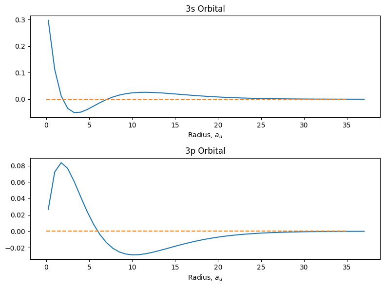
The second method is somewhat similar to the first except that it more explicitly creates and links subplots, called axes.
To create a figure with subplots, we first need to generate the overall figure using the plt.figure() command again, and
we also need to attach it to a variable so that we can explicitly assign axes to it. To create each subplot, use the
add_subplot(rows, columns, plot_number) command. The arguments in the add_subplot() command are the same as plt.subplot()
seen above.
After an axis has been created as part of the figure, call your plotting function preceded by
the axis variable name as demonstrated below.
One noticable difference in this method is the functions for customizing the plots are typically preceeded with set_ such
as set_title(), set_xlim(), or set_ylabel().
fig = plt.figure(figsize=(8,6))

ax1 = fig.add_subplot(2,1,1)
ax1.plot(r, psi_3s)
ax1.hlines(0, 0, 35, linestyle='dashed', color='C1')
ax1.set_title('3s Orbital')
ax1.set_xlabel('Radius, $a_u$')


ax2 = fig.add_subplot(2,1,2)
ax2.plot(r, psi_3p)
ax2.hlines(0, 0, 35, linestyle='dashed', color='C1')
ax2.set_title('3p Orbital')
ax2.set_xlabel('Radius, $a_u$')

plt.tight_layout();
17.5.7. 3D Plotting#
To plot in 3D, we will use the approach outlined in the Multifigure Plots with two additions. First, add
from mpl_toolkits.mplot3d import Axes3D as shown below. Second, make the plot 3D by adding projection='3D'
to the plt.figure() command. After that, it is analogous to the two dimensional plots above except \(x\), \(y\),
and \(z\) data are provided.
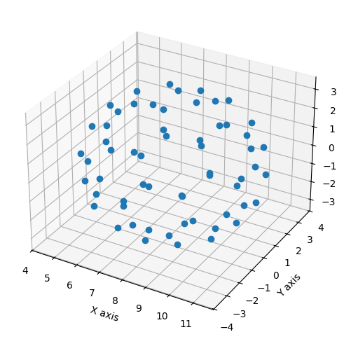
In the following example, we will import \(xyz\)-coordinates for a C\(_{60}\) buckyball molecule and plot the carbon atom positions in 3D.
from mpl_toolkits.mplot3d import Axes3D

C60 = np.genfromtxt('data/C60.csv', delimiter=',', skip_header=1)
x, y, z = C60[:,0], C60[:,1], C60[:,2]

fig = plt.figure(figsize = (10,6))

ax = fig.add_subplot(1,1,1, projection='3d')
ax.plot(x, y, z, 'o')

ax.set_xlabel('X axis')
ax.set_ylabel('Y axis')
ax.set_zlabel('Z axis');
17.5.8. Surface Plots#
The above 3D plots are simply scatter plots in a three-dimensional space. It is often useful to connect these points
to describe surfaces in 3D space which can be used for energy surfaces or atomic orbital shapes among other applications.
We again will import Axes3D from mpl_toolkits.mplot3d, but we also need to generate
a mesh grid to create a surface plot. Mesh grids are simply the \(x\)- and \(y\)-axes values extended into a 2D array. A
simple example is shown below where the \(x\) and \(y\) axes are integers from 0 \(\rightarrow\) 8. In the left grid, the
values represent where each point is with respect to the \(x\)-axis, and the right grid is likewise where each point is
located with respect to the \(y\)-axis.
We will use NumPy to generate these grids as NumPy arrays. If you have not yet seen NumPy, you can still follow along in this example without understanding how arrays operate, or you can read chapter 4 and come back to this topic later. For those who are familiar with NumPy, being that the two grids/arrays are of the same dimension, all math is done on a position-by-position basis to generate a third array of the same dimensions as the first two. For example, if we were to take the sum of the squares of the two grids above, we would get the following grid.
Notice that each value on the \(z\) grid is the sum of the squared values from the equivalent positions on the \(x\) and \(y\) grids, so for example, the bottom left value is 64 because it is the sum of 64 and 0.
To generate mesh grids, we will use the np.meshgrid() function from NumPy. It requires the input of the desired values from
the \(x\) and \(y\) axes as a list, range object, or NumPy array. The output of the np.meshgrid() function is two arrays
– the \(x\)-grid and \(y\)-grid, respectively.
import numpy as np

x = np.arange(-10, 10)
y = np.arange(-10, 10)

X, Y = np.meshgrid(x, y)
Z = 1 - X**2 - Y**2
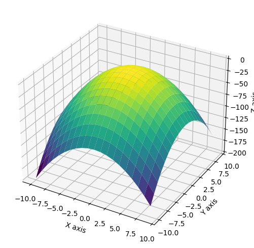
Now to plot the surface. We will use the plot_surface() function which requires the X, Y, and Z mesh grids as
arguments. As an optional argument, you can designate a color map (cmap). Color maps are a series of colors or shades
of a color that represents values. The default for matplotlib is viridis, but you can change this to anything from a
wide selection of color maps provided by matplotlib. For more information on color maps, see the matplotlib website.
from mpl_toolkits.mplot3d import Axes3D

fig = plt.figure(figsize=(10,6))

ax = fig.add_subplot(1,1,1, projection='3d')
ax.plot_surface(X, Y, Z, cmap='viridis')

ax.set_xlabel('X axis')
ax.set_ylabel('Y axis')
ax.set_zlabel('Z axis');
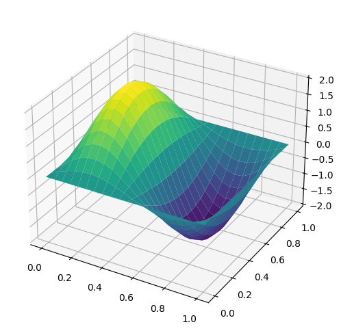
Another example, we can plot the standing waves for a 2D particle in a box by the following equation where \(n_x\) and \(n_y\) are the principle quantum numbers along each axis and \(L\) is the length of the box.
We will select \(L\) = 1, \(n_x\) = 2, and \(n_y\) = 1. Again, a meshgrid is generated and a height value is calculated from the \(x\)- and \(y\)-values.
L = 1
nx = 2
ny = 1

x = np.linspace(0, L, 20)
y = np.linspace(0, L, 20)
X, Y = np.meshgrid(x,y)

def wave(x, y):
    psi = (2/L) * np.sin(nx*np.pi*X/L) * np.sin(ny*np.pi*Y/L)
    return psi

fig = plt.figure(figsize=(10,6))
ax = fig.add_subplot(111, projection='3d')
ax.plot_surface(X, Y, wave(X, Y), cmap='viridis');
17.5.9. Animation#
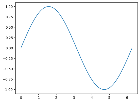
The easiest way to make a live animation in Matplotlib is to use one of the Animation classes.
Animation |
A base class for Animations. |
|---|---|
FuncAnimation |
TimedAnimation subclass that makes an animation by repeatedly calling a function func. |
ArtistAnimation |
TimedAnimation subclass that creates an animation by using a fixed set of Artist objects. |
Following are examples that use FuncAnimation. To run these examples save in one file and run in the command console.
import matplotlib.pyplot as plt
import numpy as np
import matplotlib.animation as animation

fig, ax = plt.subplots()

x = np.arange(0, 2*np.pi, 0.01)
line, = ax.plot(x, np.sin(x))


def animate(i):
    line.set_ydata(np.sin(x + i / 50))  # update the data.
    return line,


ani = animation.FuncAnimation(
    fig, animate, interval=20, blit=True, save_count=50)

plt.show()
import numpy as np
import matplotlib.pyplot as plt
import matplotlib.animation as animation

x = np.linspace(0, 10)
y = np.sin(x)

fig, ax = plt.subplots()
line, = ax.plot(x, y)

def update(num, x, y, line):
    line.set_data(x[:num], y[:num])
    return line,

ani = animation.FuncAnimation(fig, update, len(x), interval=100,
                              fargs=[x, y, line], blit=True)

plt.show()
import matplotlib.pyplot as plt
import numpy as np
import matplotlib.animation as animation

fig, ax = plt.subplots()
t = np.linspace(0, 3, 40)
g = -9.81
v0 = 12
z = g * t**2 / 2 + v0 * t

v02 = 5
z2 = g * t**2 / 2 + v02 * t

scat = ax.scatter(t[0], z[0], c="b", s=5, label=f'v0 = {v0} m/s')
line2 = ax.plot(t[0], z2[0], label=f'v0 = {v02} m/s')[0]
ax.set(xlim=[0, 3], ylim=[-4, 10], xlabel='Time [s]', ylabel='Z [m]')
ax.legend()


def update(frame):
    # for each frame, update the data stored on each artist.
    x = t[:frame]
    y = z[:frame]
    # update the scatter plot:
    data = np.stack([x, y]).T
    scat.set_offsets(data)
    # update the line plot:
    line2.set_xdata(t[:frame])
    line2.set_ydata(z2[:frame])
    return (scat, line2)


ani = animation.FuncAnimation(fig=fig, func=update, frames=40, interval=30)
plt.show()
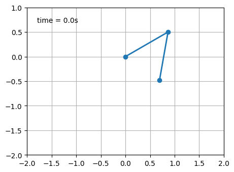
# Double pendulum animation

import matplotlib.pyplot as plt
import numpy as np
from numpy import cos, sin
import matplotlib.animation as animation

G = 9.8  # acceleration due to gravity, in m/s^2
L1 = 1.0  # length of pendulum 1 in m
L2 = 1.0  # length of pendulum 2 in m
L = L1 + L2  # maximal length of the combined pendulum
M1 = 1.0  # mass of pendulum 1 in kg
M2 = 1.0  # mass of pendulum 2 in kg
t_stop = 2.5  # how many seconds to simulate
history_len = 500  # how many trajectory points to display


def derivs(t, state):
    dydx = np.zeros_like(state)

    dydx[0] = state[1]

    delta = state[2] - state[0]
    den1 = (M1+M2) * L1 - M2 * L1 * cos(delta) * cos(delta)
    dydx[1] = ((M2 * L1 * state[1] * state[1] * sin(delta) * cos(delta)
                + M2 * G * sin(state[2]) * cos(delta)
                + M2 * L2 * state[3] * state[3] * sin(delta)
                - (M1+M2) * G * sin(state[0]))
               / den1)

    dydx[2] = state[3]

    den2 = (L2/L1) * den1
    dydx[3] = ((- M2 * L2 * state[3] * state[3] * sin(delta) * cos(delta)
                + (M1+M2) * G * sin(state[0]) * cos(delta)
                - (M1+M2) * L1 * state[1] * state[1] * sin(delta)
                - (M1+M2) * G * sin(state[2]))
               / den2)

    return dydx

# create a time array from 0..t_stop sampled at 0.02 second steps
dt = 0.01
t = np.arange(0, t_stop, dt)

# th1 and th2 are the initial angles (degrees)
# w10 and w20 are the initial angular velocities (degrees per second)
th1 = 120.0
w1 = 0.0
th2 = -10.0
w2 = 0.0

# initial state
state = np.radians([th1, w1, th2, w2])

# integrate the ODE using Euler's method
y = np.empty((len(t), 4))
y[0] = state
for i in range(1, len(t)):
    y[i] = y[i - 1] + derivs(t[i - 1], y[i - 1]) * dt

# A more accurate estimate could be obtained e.g. using scipy:
#
#   y = scipy.integrate.solve_ivp(derivs, t[[0, -1]], state, t_eval=t).y.T

x1 = L1*sin(y[:, 0])
y1 = -L1*cos(y[:, 0])

x2 = L2*sin(y[:, 2]) + x1
y2 = -L2*cos(y[:, 2]) + y1

fig = plt.figure(figsize=(5, 4))
ax = fig.add_subplot(autoscale_on=False, xlim=(-L, L), ylim=(-L, 1.))
ax.set_aspect('equal')
ax.grid()

line, = ax.plot([], [], 'o-', lw=2)
trace, = ax.plot([], [], '.-', lw=1, ms=2)
time_template = 'time = %.1fs'
time_text = ax.text(0.05, 0.9, '', transform=ax.transAxes)

def animate(i):
    thisx = [0, x1[i], x2[i]]
    thisy = [0, y1[i], y2[i]]

    history_x = x2[:i]
    history_y = y2[:i]

    line.set_data(thisx, thisy)
    trace.set_data(history_x, history_y)
    time_text.set_text(time_template % (i*dt))
    return line, trace, time_text

ani = animation.FuncAnimation(
    fig, animate, len(y), interval=dt*1000, blit=True)
plt.show()
C:\Users\corcuerp\AppData\Local\Programs\Python\Python312\Lib\site-packages\matplotlib\animation.py:892: UserWarning: Animation was deleted without rendering anything. This is most likely not intended. To prevent deletion, assign the Animation to a variable, e.g. `anim`, that exists until you output the Animation using `plt.show()` or `anim.save()`.
  warnings.warn(
17.6. Further Reading#
The matplotlib website is an excellent place to learn more about plotting in Python. Similar to some other Python library websites, there is a gallery page that showcases many of the capabilities of the matplotlib library. It is often worth browsing to get ideas and a sense of what the library can do. The matplotlib website also provides free cheatsheets summarizing key features and functions.
Matplotlib Website. https://matplotlib.org (free resource)
The Matplotlib gallery provides many examples.
Matplotlib Cheatsheets https://matplotlib.org/cheatsheets/ (free resouce)
VanderPlas, J. Python data Science Handbook: Essential Tools for Working with Data, 1st ed.; O’Reilly: Sebastopol, CA, 2017, chapter 4. Freely available from the author at https://jakevdp.github.io/PythonDataScienceHandbook/ (free resource)
Matplotlib Colormap Reference https://matplotlib.org/stable/gallery/color/colormap_reference.html (free resource)
Matplotlib Marker Reference https://matplotlib.org/stable/api/markers_api.html (free resource)
A nice Matplotlib tutorial by Nicolas Rougier, Mike Muller and Gael Varoquaux.
